|
|
I actually use a few different coloring
techniques, but this particular one is fairly new and one I'm pretty
fond of using for
my short comics. This coloring style works for single images as well
as comics, though, so don't think you only have to use it in comics.
Also, if you have a preferred way of doing things than what I mention
here, feel free to differ from the tutorial if it best suites your
needs! :) My way is not the only way, and I'm still learning new techniques
myself. Think of this as a guideline to get you on your way, or to
find
a new way of doing something you already know.
Unlike most digital-coloring artists, I use Paintshop Pro instead of Photoshop.
This is for a few reasons:
+ I have 5+ years of personal (home use) experience with Paintshop Pro 6-8, whereas
I only have about a semester's worth of educational experience in Photoshop 5,
6, and CS.
+ The only version of Photoshop I own is at my parents' house some five hours
from where I live now.
+Said version is PS 5 LE, which, in my opinion, sucks anyway.
+ I'm currently too poor to buy a newer version of Photoshop (one day, though...)
So... This tutorial is made using Paintshop Pro 8, which, while it has many similarities
with Photoshop, is still different enough that you might have to figure out some
things on your own... Sorry. If anyone knows the PS equivenlent of doing something
I do here in PSP 8, feel free to e-mail me and
I can point out the alternative for PS users. :)
Without further delay, here is the...
Comic Coloring Tutorial
|
Materials Used: |
*These are what I used and are
a general guideline -- for the most part, if you have other tools that
you use that give the same results, feel free to use them instead)
+ Scanner =P
+ Paintshop Pro 8
+ Mouse to "draw"
+Tablet to draw (with and/or instead of a mouse;I own one and usually
use it, but either a mouse or tablet is fine) |
Step 1: Import
Lineart |

Click thumbnail for a larger view.
1-B1:

Click thumbnail for a larger view.
1-B2:

Click thumbnail for a larger view.
1-B3:

Click thumbnail for a larger view.
1-B4:

Click thumbnail for a larger view. |
A. First and foremost, import your
artwork into PSP. This is a coloring tutorial, so I won't go into
depth about inking or cleaning up lineart
here, but I did create a seperate tutorial on lineart found
here if you need it.
B. Once the page is imported
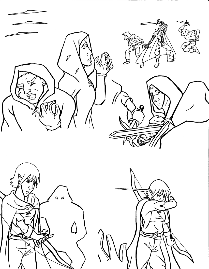
and cleaned up, I "break up" the panels into seperate images:
*NOTE: If you're just coloring
a normal picture and not a comic page, you can skip this part and
go to section C in
this step.*
1. Click the Selection Tool. 
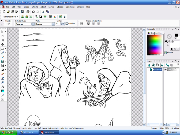
2. Click and drag the selection box around the first panel.
3. Once it's selected, copy it (Ctrl+C) and paste it into a new
image (Ctrl+V). See screencaps 1-B1 and 1-B2.
4. Save the panel as a .psp (or .psd if you're using Photoshop/prefer)
file. I name my panel files by page number, stating it's a "source"
file, then by panel number. For instance, the first panel of the
first page would be "1src1.psp (the "src" standing for "source"),
while the third panel on the second page would be "2src3.psp".
You can name them however you want; I just find this method handy
for keep track of multiple pages and panels.
5. Repeat the process for the other panels.
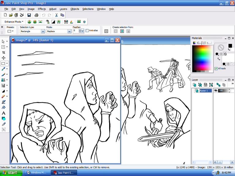
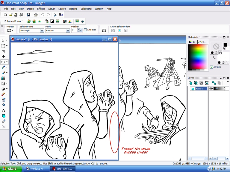
6. Once all the panels are saved as seperate images, you can delete
the original scan file, as you'll no longer need it. Since your
artwork may not have fit into your panels perfectly, you may have
to do a little extra line art cleaning up for those lines that
didn't quite make it to the bottom of the panel, or the lines from
another frame that made it into your panel. Take note of these
"seeping" lines in screencap 1-B3. I simply white these lines out,
and behold! Problem solved (See screencap 1-B4)!
C. Time to finish up preparing
the lines to color. I strongly suggest "prepping" the lineart for
all the panels at once, as it's easier to keep track of things.
1. Select the Magic Wand tool. 
2. Look to the top of the program window at your tool settings.
If it's not there, right-click anywhere at the menu choice; a new
menu
window will pop up by your pointer. Choose "Palettes >> Tool
Options" and it will appear.
3. Set your Magic Wand tool settings as such (here
is screencap of the settings):
A. Match Mode RGB
B. Tolerance 0
C. Feather 0
D. Anti-alias UNchecked
4. Using the Magic Wand, click on any white area of the image. The
area should
now be selected.
5. While the area is still selected, go to the top menus and choose "Selections
>> Modify >> Select Similar." A window will pop up; ensure that Tolerance is
set to 0, "Discontiguous" is selected, "Anti-alias" is UNchecked, and "Sample
Merged" is also UNchecked. Hit OK.
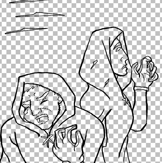
6. All the white areas should
now be selected. Hit "Delete" on your keyboard. This should remove the white
areas and leave you with a checkered background,
indicating anything aside from the black lines is "transparent." If not, check
your Layers palette (shortcut
"F8" in PSP 8 and "L" in PSP 6/7) and ensure that your image is a raster
layer (It will be titled "Raster 1" by default). If it says, "Background," right-click
it and select "Convert to Raster Layer." Once this is done, try deleting the
white area again. It should now work.
7. Right-click anywhere in the image to remove the selection. Next, hit "Ctrl+C"
to copy the lineart.
8. Hit "Ctrl+L" to paste the lineart as a new layer in your image. You will probably
have to move your lineart around to perfectly align it with the lineart below
(zoom in and use a small reference point to tell when the layers are aligned
properly). This can be done with the Move tool  by
click, holding, and dragging the upper lineart until it's aligned with the lower
layer. Here is an example of how it might
look. by
click, holding, and dragging the upper lineart until it's aligned with the lower
layer. Here is an example of how it might
look.
9. Rename the layer "Raster 2" to "Lineart" and "Raster 1" to "Colors."
10. Repeat for the other panels. |
|
Step 2: Coloring
the "Flats" |
2-A1:

Click thumbnail for a larger view.
2-B1:

Click thumbnail for a larger view.
2-B6:

Click thumbnail for a larger view. |
A. Now it's
time to color the base colors, or the "flats." I use the term "flat"
loosely here, though, as I use gradients as my base colors. Also,
we will be coloring "section" by "section" -- For example, Person
1's skin first, then Person 2's skin, then Person 1's hair, etc.
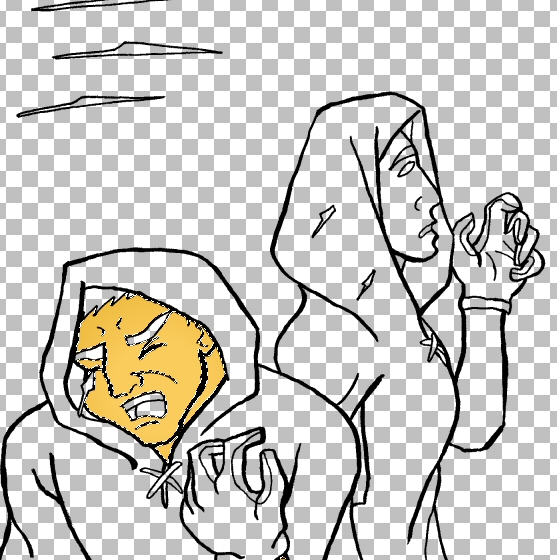
1. Make sure you're on the "Colors" layer. If not, obviously,
click on it to switch to it.
2. With the Magic Wand Tool still
selected, and the same
settings as before, select the areas you want to color (remember,
go in "sections"). To select more than one area (for instance,
the face and the arm), hold down "Shift" when clicking
on other areas. Similarly, if you select an area you don't want,
hold down "Ctrl"
when clicking in that area to remove it. See Screencap 2-A1.
3. Now, go to your Materials
(colors) palette and select your color, the same
for the background and foreground color.
4. Right-click on your foreground color box to open up the Material
window with the Color tab open.
5. Go to the Light number and move the slider down by about 30-60
numbers, depending on how light/dark your base color is (see
screencap). Once the color is significantly darker than its base,
hit Ok.
6. Back to the Materials palette; Underneath your (now darker) foreground
color, click on the button with a black circle on it. This will show
a list of three buttons with circles in them, including the intial
black. Click on the second button, a cirlce with black and white
vertical stripes going down it. This
is the gradient option and sets your foreground color as a gradient.
7. By default, the gradient is linear, black to white. We're going
to change that. Click on the foreground color like you did a few
steps ago. This will open the Materials window again, only this time
with the Gradients tab open.
8. This part is somewhat a matter of personal preference -- when
I'm coloring organic parts of an image (skin, hair, eyes, teeth,
etc) I use a radial gradient instead of a linear gradient, which
I use for anything non-organic (clothes, weapons. You can change
the gradient to radial by clicking on its button: 
9. Whether you use a radial or linear gradient, now you have to change
the color of the gradient. Click the down-pointing arrow by the gradient
box. This will open up a fairly long list of different kinds of gradients.
Scroll down until you come to the "Foreground-Background" gradient
(see screencap).
Select it, of course.
10. Before you exit the Materials window, make sure the "Invert"
box is checked. Also, adjust the direction of the gradient by either:
- Clicking on the line and rotating it around until it's at the
desired angle (linear gradient)
OR
- Clicking on the smallest/lightest spot on the gradient and moving
it about until it's at its desired location (radial gradient)
You will probably need to return to the Materials window every now
and then to readjust your direction and such, depending on where
your light source is coming from. Hit OK to exit.
B. Now you can finally
get to actually coloring the image. Well, almost.
1. Select the Flood Fill Tool. 
2. Go to the Tool Options palette and make sure the settings are
as such:
A. Match Mode NONE (Very important!)
B. Blend Mode Normal
C. Opacity 100
With the Match Mode set to None, the flood fill tool will fill in
everything that's selected on the current layer, ignoring all other
parts of the image. If no specific area is selected, it fills the
entire area, which is why back up in section A I had you select
which area to fill. The reason for doing this instead of simply
clicking and filling is that the gradients look better and the change
in color more obvious. Here's
a visual of what I mean.
If I haven't utterly confused you yet, let's move on to finally
filling in the colors.
3. Simple enough. Using the Flood Fill tool, click inside your selected
area in the image. This will, of course, fill in the color. See
screencap 2-B1.
4. Switch back to the Magic Wand and
right-click on the image to deselect the selection.
5. Repeat the whole select-section, set colors, fill, and deselect-section
process. I strongly suggest before switching colors, however, that
you go into the other panels and fill in any areas there that use
the same color, if any (for instance, if you have a character in
multiple panels, and you colored their skin in the first panel,
fill in their skin for all the other panels). This insures the colors
for that particular area remain consistant throughout the page.
Note: To change the foreground color without having to switch it
back from gradient mode, click on the smaller color boxes in the
corner of the Materials palette: 
If you are coloring a long-term comic with at least a few dozen
pages, I suggest making a seperate image with source colors for
certain characters, objects, etc. Heck, even if you're just coloring
a single image with this tutorial, if you draw the same characters
often, a color reference file is still handy.
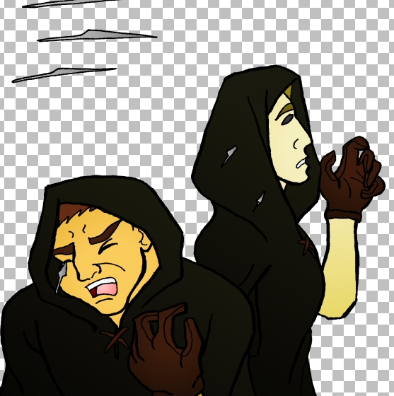
6. Keep coloring until you've got all the flats done for all the
panels. See screencap 2-B6. Once that's done, you can move on to
shading and highlighting. Whee. |
|
Step 3: Shading
and Highlighting |
3-A1:

Click thumbnail for a larger view.
3-A6:

Click thumbnail for a larger view.
3-A8:

Click thumbnail for a larger view.
3-B5:

Click thumbnail for a larger view.
3-B7:

Click thumbnail for a larger view. |
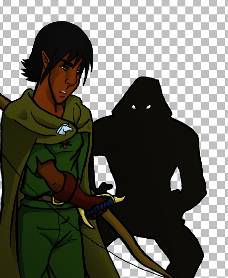
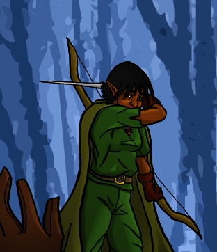
A. Here comes
the part that gets kind of tedious (in my opinion), but really adds
more to the picture. Shading and highlighting! How I do my highlighting
is pretty similar to how I do my shading, but a bit more in-depth,
so I'll go into each of them in detail, shading first.
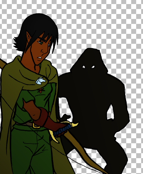
1. By now, of course, all your flats should be done, like in screencap
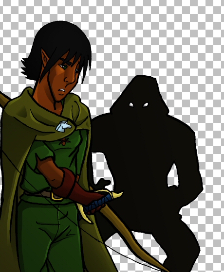
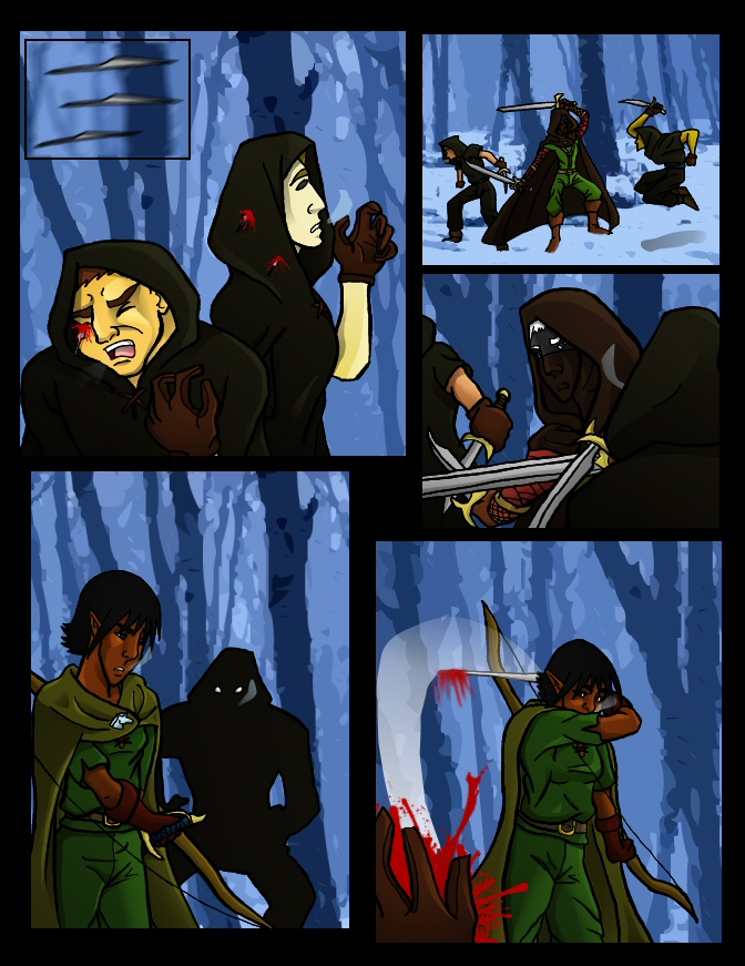
3-A1 (I'm using a different panel for this step. I got tired of looking
at the pair of assassins with throwing daggers sticking out of them.
:P).
2.
Create a new raster layer above your Color layer, but below your
Lineart layer ("Layers >> New Raster Layer...") Name it "Shading"
and set the Opacity to 50.
3. In your Materials palette, set it to no foreground color (hit
the Transparent  button
below the main foreground color box) and change the background color
to black, and put it in gradient mode. button
below the main foreground color box) and change the background color
to black, and put it in gradient mode.
4. Click the background color box to open up the gradient properties.
Change the gradient to linear (if it isn't already) using the "Fading
Background" scheme. Adjust the angle of the gradient as needed, then
hit OK to exit the window.
5. Select the Pen tool.  Ensure
that no foreground color is selected and the background color is
a gradient in your Materials palette. Go to the Tool Options palatte
and make sure the settings are
as such: Ensure
that no foreground color is selected and the background color is
a gradient in your Materials palette. Go to the Tool Options palatte
and make sure the settings are
as such:
A. Simple Mode UNchecked
B. Drawing Mode ON
C. Freehand Segment Type
D. Anti-alias UNchecked
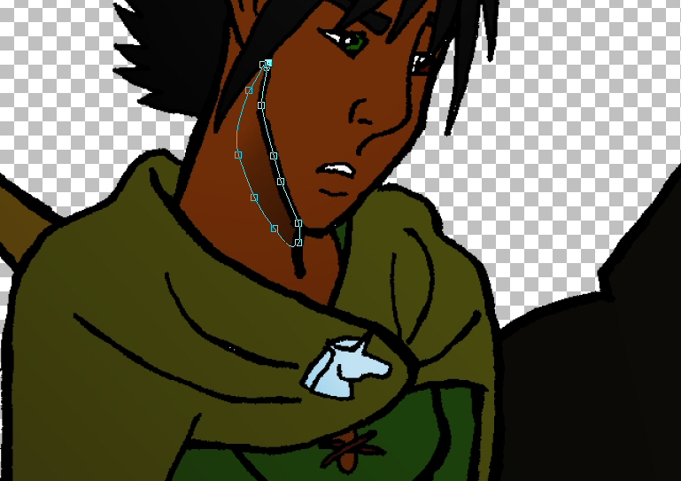
6. With the Pen tool, draw ONE section of your shading (I did the neck first).
As mentioned in my lineart tutorial, "Simple
Mode" just shows the lines you draw as
they are. When it's off, it shows all
the points that make up what you drew with the pen tool, allowing you to
adjust the lines by clicking, holding, and dragging the points to other locations.
You can turn simple mode on and off as you please, but keep in mind that you
can no longer edit a line's points once you've saved or switched to another tool
unless your line is a vector (and it shouldn't be here).
That being said, after you've drawn your one section of shading, use the points
(Simple Mode off) to fix it until you have it the way you want it. See screencap
3-A6.
7. Once the shaded section is as desired, go to the Tool Options palette and
click the New Shape button. 
If
you
don't
do
this, whenever you go to draw another shaded section, the gradient will "expand"
as
you go along,
and that won't look
good. Here's what I'm
talking about. Notice how the shading is too solid over by the far eye and
nose, and doesn't even show up at all at the ear? That's due to the gradient
"spreading", so you don't want that. You want each section to shade to look pretty
similar to the way the shading is around the neck.
8.
Go
back
to
the
Pen
tool
and
draw
the
next
section
of
shading. Repeat the whole process of drawing the shaded sections (changing the
direction of the gradient as needed) for each area you want to shade in each
panel
until
you've
got
everything
done.
It
will
probably
take quite some time, but as you can see in screencap 3-B8, it's already looking
a lot nicer.
B. Next is the highlighting, which, while in execution is
similar to the shading, is a little more complex.
1. Create a new layer above the Shading layer. Name it "Highlighting," set the
Blend Mode to Screen, and the Opacity to 70.
2.
Decide what section
you want to highlight first (I decided to go with skin first). Using the Dropper
tool  ,
right-click on the lightest area in the section you want to highlight. You
may
have to hide the Shading layer to do this (To hide a layer, click the Visibility
Toggle ,
right-click on the lightest area in the section you want to highlight. You
may
have to hide the Shading layer to do this (To hide a layer, click the Visibility
Toggle  button next to the
it. Click it again to make the layer visible once more). button next to the
it. Click it again to make the layer visible once more).
Right-clicking
with the Dropper tool will change your background color, which should still have
the Fading Background gradient set.
3. Draw one section of your highlights at a time, in the same manner as you did
shading.
4. For areas with extra bright highlighting, first draw the highlight in. Once
it's the shape you want, use the Magic Wand tool to select it. You might have
to hide the Color and Lineart layers to select it right; PSP 8 has an annoying
habit of selecting stuff from layers above/below the current one unless they're
hidden.
NOTE: If you want to add a stronger highlight spot within
another highlight, instead of drawing the new highlight, simply use the Freehand
Selection tool  to select the
particular area you want to brighten. to select the
particular area you want to brighten.
5. Once the area to extra-highlight is selected, click the Flood Fill tool. In
the Tool Options palette, change the blend mode to Screen (this makes any color
you use fill in lighter than it actually is on the image). Right-click inside
the selection to brighten it. You can click it again to brighten it even more,
but I wouldn't recommend brightening it any more than that, unless you have a
very strong light source. See screencap 3-B5 for an example of the result of
highlighting and extra highlighting.
6. Use the Magic Wand tool and right-click inside the image to deselect the highlighted
area once it's at its desired brightness.
7. Repeat the process for other highlighted areas, switch colors when you highlight
different sections (i.e. use one color for the skin, another for the clothes,
etc). This will probably take even more time to do than the shading, but patience
pays off (as hard as it is to keep...). Look at screencap 3-B7. Seems a lot nicer
now,
doesn't
it? |
|
Step 4: Effects/Adding
the Background |

Click thumbnail for a larger view. |
A. Once you've
finished all the shading and highlighting, check through your panels
and make sure there aren't any mistakes you missed, and fix any that
you do find.
At this point, this is where I add most of my "effects" like
blood splatter, action swish lines, etc. However, this
lesson's already long enough, so I won't go into detail about it
here. =P That's another tutorial for another day... perhaps.
As soon as I'm certain I have all the details and effects I want
that I need to "work bigger" to add, I reduce my panels
by 25%. To do this, I open one of my panel images.
1. Hold "Shift+S" The resize window will pop up.
2. Make sure "Lock aspect ratio" is checked and the default number
in the box ("0.6970") remains.
3. Under "Pixel Dimensions," make sure you're resizing by percent,
not by pixels (there's a drop-down box next to the "Width" and "Hight" boxes)
and
type in
25 in the first box -- the second box should automatically change
to 25 as well.
4. Check "Resample" and Choose "Smart Size" from
the drop-down list.
5. Check "Resize all layers" and hit OK. Here's a screencap
of my settings if my descriptions weren't clear enough. The image will
now resize -- this may take a few seconds to process on
your
computer,
depending
on the memory available.
6. Repeat for the other panels.
B. As many of my friends
can attest to, I HATE drawing backgrounds. So, being the cheap,
lazy
shortcutter that I am, I "cheat" on my backgrounds
using photos and Flash tweaking, which is described in depth
in yet another
tutorial (didn't I already say this one was long enough? =P)
1. Go to each panel image and create a new layer. Name it "Background" and
move it to the bottom.
2. After I've made a satisfactory background in Flash and "published" it
as a .png file, I open it in PSP8.
3. I copy the background image ("Ctrl+C") then open up the panel
image and paste into the Background layer ("Ctrl+E").
Note: Sometimes I have to resize the background image before pasting
it into the panel. By how much varies on my needs, but I use the
same principles in resizing as explained in part A of this step;
I just vary the percentage of resizing.
4. I repeat the process for the other panels, using/making different
background images if need be.
|
|
Step 5: Arranging
the Page |

Click thumbnail for a larger view. |
Once all
the panels are finished, it's time to put them all together onto
a page.
1. Open up a new image with the dimentions
672x861.
2. Name the current layer "Page" and use the Flood Fill to make it
black (or white, or whatever color you want the "paper" to be --
I use black all the time, personally).
3. Make two more layers on top of the Page layer. Name the first
one "Panels" and the second (top) one "Dialogue.
4. Go to the "Panels" layer. This is, of course, where you'll put
your panels.
5. Open up the first panel image and go to the "Layer" menu and choose
"Merge >> Merge Visible"
6. Once the layers are merged, copy the image and return to the comic
page. Paste ("Ctrl+E") the first frame into the Panels layer, moving
it to its desired location.
7. Repeat the process for the other panels until you have the whole
page laid out as you wish. |
|
Step 6: Inserting
the Dialogue |
6-B6:

Click thumbnail for a larger view.
6-B9:

Click thumbnail for a larger view.
6-B12:

Click thumbnail for a larger view. |
A. What's a
comic without dialogue? Often, not much, though there are times when
you might need a page to speak for itself without words. Of course,
I'm assuming this isn't one of those times.
Before I go on, keep this in mind: I don't like speech bubbles. Well,
I don't mind seeing them in others' comics,
but I don't like using them. They often block out part of the image,
which I don't like to do, or you have to make extra space for them
so that they don't block out part of the panel. Since I change around
things, I don't like doing that either. =P
So, what do I do instead? I just put the text in there on its own.
How can I do that without getting characters' words confused/making
it hard to read with certain backgrounds? Well, I keep the main text
black (sometimes white if the outline color is dark and/or if the
background is dark enough to make even outlined black text hard to
read). The outline for the text is a seperate color, different for
each character.
For example, the outline of Saeola's dialogue is always a dark shade
of green, while the dialogue for Falear (not in this page), is always
outlined in brown.
So, if you want to figure out how to do speech bubbles, you won't
find out here. Sorry. I shall proceed in my own style.
Note: I use custom fonts downloaded from sites such as Blambot and
1001 Fonts. What font you use is up to you, but I highly suggest
at least looking through those sites -- much of them are free, and
well-suited for comics.
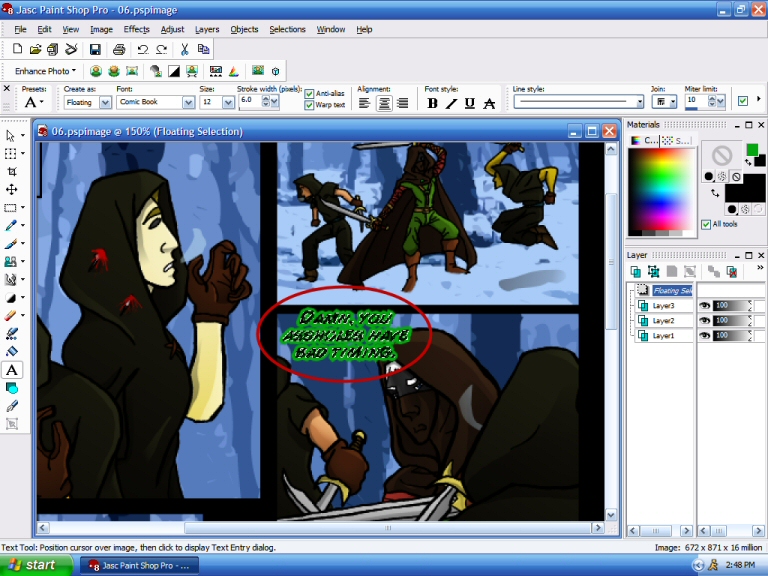
B. All right, I'm finally
getting to the actual insertion of dialogue. =P
1. Go to the "Dialogue" layer, of course.
2. Make sure your colors are all back to solids instead of gradients.
3. Set the background color to black and the foreground color you
use for the current character talking (in this case, I'm doing Sab'vrae
first, so the foreground color is a lighter green).
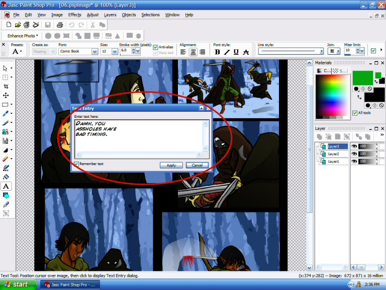
4. Click on the Text Tool  and
use the following settings: and
use the following settings:
A. Create As: Floating
B. Font: Comic Book (This is a downloaded font, and you can acutally
use whatever you want -- this is just my personal favorite to use
for most "normal" dialogue)
C. Size: 12 (For "normal" speech, I use 12 or 14, depending on the
amount of text and space I have in the panel -- if someone is shouting
or whatnot, I'll use a bigger size, even if it's just for a word
or two).
D. Anti-alias and Warp Text checked
E. Auto Kern checked
Notes: I also make the Stroke Width (that's the outline width) about
4-6 so it's noticeable around the text) and keep my Alignment centered.
5. Click anywhere on the image with the Text Tool. A window will
pop up for you to type in your dialogue.
6. Of course, type in your text. We're going one character, one "bubble"
at a time, so remember that. =P Also, depending on the size of your
font, amount of text, and amount of space in the panel you have,
you probably won't write your text all in one line. I usually keep
it to about two-three words per line. See
screencap 6-B6 of what
my first block of dialogue looks like in the editing window.
7. Make sure "Remember Text" is checked, then hit "Apply" once you've
got your font the way you want it and move it to where you want.
What's this? Only the outline's visible? Where's the inside of
the text? I can't read it! Yes, if you made the Outline 4-6 thick
like I did, and aren't in a larger font size (as in 18+), it will
look like this. You're not quite finished. =P Remove the foreground color
in your palette by hitting the  button
below it. button
below it.
8. Hold "Ctrl+D" to deselect the text. Still using the Text Tool,
click inside the image to bring
up
the
Text Entry
window again.
Your last entry of text should still be there. (If not, you'll have
to retype it exactly as it was before. This is why you want "Remember
Text" on. =P). Hit "Apply."
9. Yay! There's your text without the outline. Move it within your
last entry of text until it's centered within the outline. See screencap
6-B9. Hold "Ctrl+D" to deselect the text once more.
10. Repeat the process for all the other lines of dialogue. I suggest
doing all the lines for one character first, then moving on to another
character (and thus changing the outline color).
11. For "sound effect" text, I use the same principles as above,
with a few changes:
A. I use the "Comic Book Commando" Font (There are many fonts that
have a suitable "SFX" appearance. Look around for them)
B. I type in all caps, often with bold text as well.
C. I use a reddish gradient for the text and a lighter solid red
for the outline (most of the time; sometimes I use blue sor greens instead,
depending on the sound effect)
D. I usually add some effects, like Blur to make the hold a bit more
"impact," so to speak.
Those are just my preferences, however. Use what you wish.
Once all the dialogue/sound effects are finished, save your image
as a .jpg (or .png, or whatever compressed, web-friendly filetype
you wish), though you should keep the .psp version too, in case you
need to fix things later.
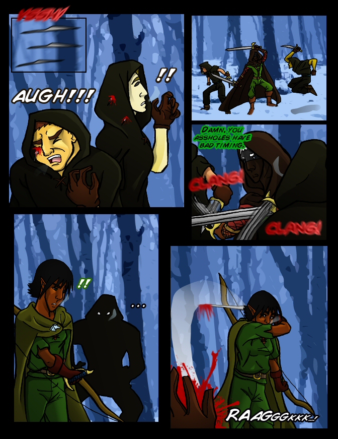
12. Well, that's it! See image 6-B12 for the finished
result. (You may note that the third panel has a few parts that are
blurred that weren't so a few substeps back. That's something I forgot
to add and realized it as I was doing my dialogue. Eheh.) Check out
my other tutorials if you're interested, and have fun!
|
All artwork on this page, unless stated otherwise, is © 2005 Briana
Higgins. While this page is used for educational purposes, none
of my art may be copied or taken without my explict written consent. |